Introducing Wordfence 7
Wordfence is the most popular WordPress security software in the world for good reason. The protection offered by the endpoint firewall outperforms alternatives. The scanner delivers the best detection in the industry. A long list of other features like country blocking, two-factor authentication and password auditing make Wordfence the best and most comprehensive security solution available for WordPress.
From the beginning, our development efforts have always focused on function over form. Having rapidly innovated for so many years, the resulting software does an extraordinary job of protecting WordPress websites, but it is also quite complex. Last summer we decided it was time to make a major investment in the user experience, making Wordfence not only the best security software available, but also intuitive and incredibly easy to use.
For the last 6 months we have been hard at work rebuilding the Wordfence user interface from the ground up. Today’s release of Wordfence 7 revolutionizes WordPress security by making a deep and complex product easier and more intuitive to use. We think Wordfence 7 is amazing, and we know you will, too.
Overview of Changes in Wordfence 7
Our goal with Wordfence 7 was simple: make Wordfence intuitive and easy to use for all users.
It needed to be easy for the novice to understand and configure without taking away any functionality from more advanced users.
To achieve that, we made the following high-level changes:
- Updated our design framework to use modern interface standards
- Focused more on the core Wordfence security features, like firewall and scan, and less on everything else
- Eliminated the ‘Options’ page and added options sections for each feature
- Added feature status indicators for core features
- Added a help page with links to documentation and support options
Design Framework
Based on current UI/UX patterns and trends, we’ve built a framework using standard interface and experience approaches. The dashboard and feature pages provide configuration status, alerts and reporting. Detailed configuration screens are easily accessible with relevant links throughout the experience. Status summaries are interactive, guiding the user directly to the security hardening opportunities and giving you real-time information on the impact of any changes you make. The resulting software is more discoverable, approachable and user-friendly.
Feature Status Circles
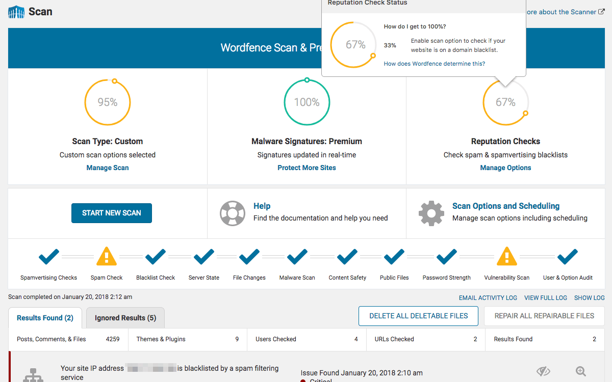
One of our objectives with Wordfence 7 is to provide security hardening opportunities to users in a simple, intuitive way. With that in mind, we are introducing status circles. They provide a clear status summary for each feature. By hovering over the status circle, you will trigger a popover detailing the list of things you can do to improve the percentage shown. All popovers include a link to detailed documentation.
We also include status circles on the scan and firewall options pages, giving you immediate feedback as you improve your security posture.
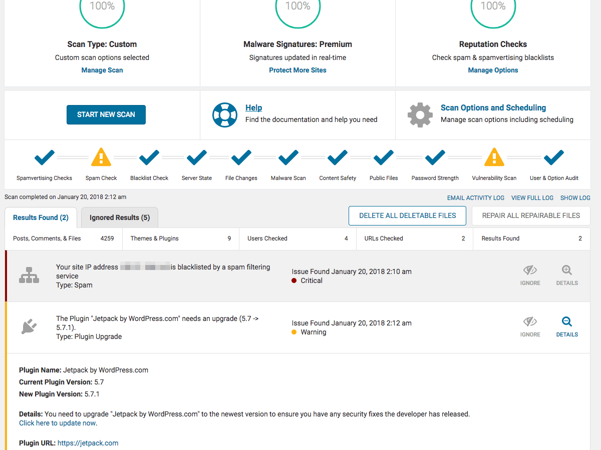
Here’s an example of the status circles on the new scan page in action:
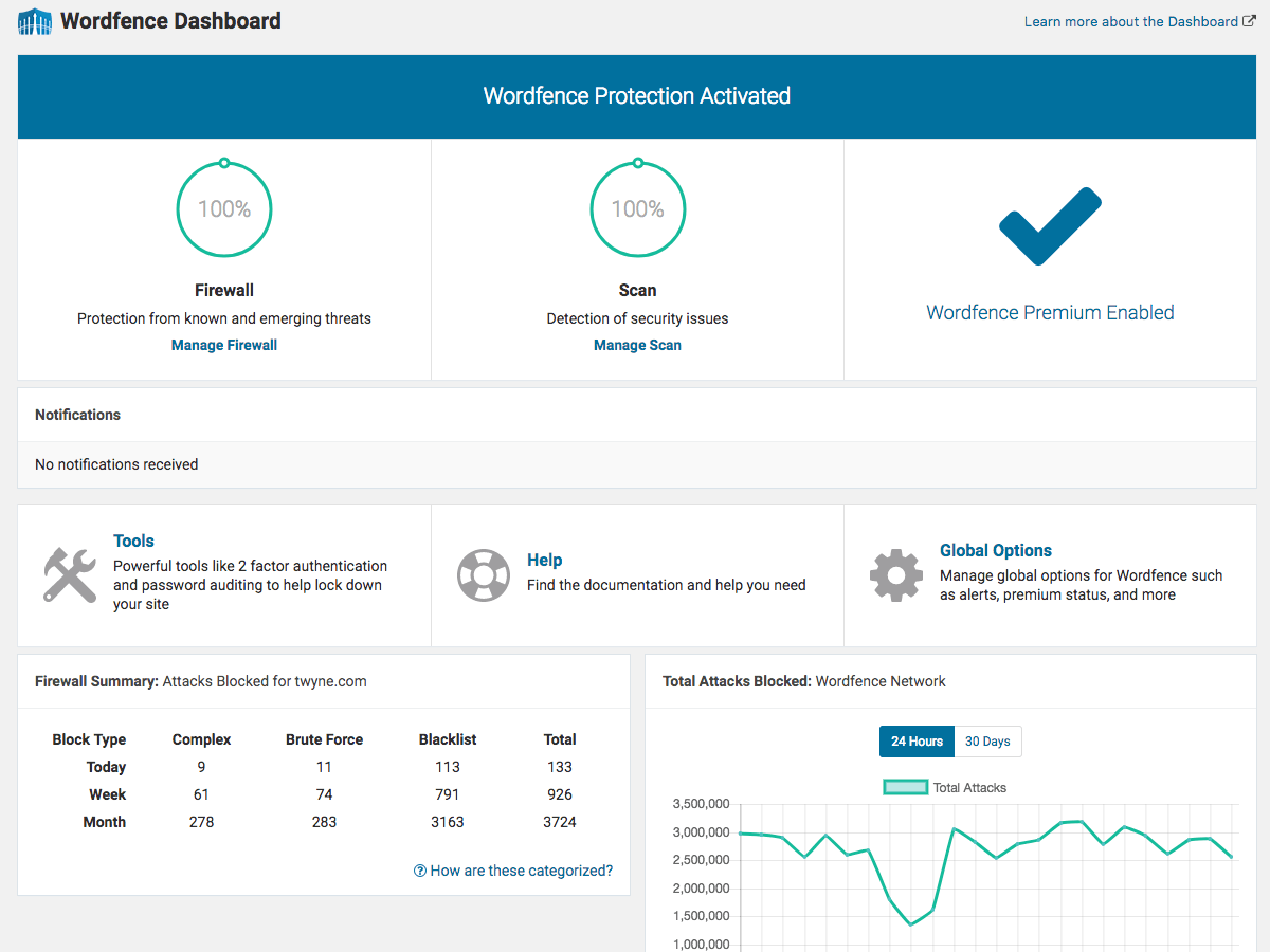
Simplified Dashboard
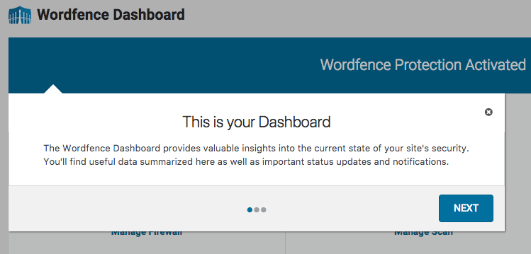
The new version of the dashboard is similar to the one we added in Wordfence 6, but is now less busy and even more useful. We added feature status sections for the firewall, scan and Wordfence Premium. You’ll still find notifications here, primarily based on scan results. Global options for the plugin are now accessible via the link on this page (more on our options page approach later).
Finally, we removed most of the charts from this page, leaving just a high-level Firewall Summary and a chart of attacks across the Wordfence network.
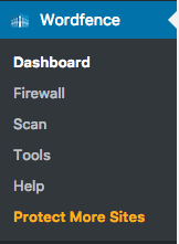
Simplified Navigation
We reduced the number of navigation options from 8 to 6. The two most important features, firewall and scan, are still available in the main navigation. Blocking is now accessible in the Firewall section and Live Traffic has been moved to Tools. Links for both features can be added back to the main navigation via their respective options, for those of you who prefer it.
The Options page has been removed completely in favor of a new approach.
New Options Sections
Prior to Wordfence 7, the majority of the Wordfence configuration options were on a single page. While there are some advantages to that approach, we found that it caused a majority of our users to never discover many useful features and options.
With Wordfence 7, you will now find an options link on all major feature pages. Global options are now accessible via a link on the Dashboard page. All options links can be found next to a gray gear icon.
Help Page
We know that security is a complex topic, and that configuring Wordfence can be challenging for less technical users, especially with some of the more exotic hosting configurations we sometimes come across. In an effort to make it easier to find the documentation or support you need, we added a Help page to the plugin. It includes links to our documentation organized by feature, along with links to our most popular help articles. Links to our free and Premium support options are also available, and you will find links to the new help section throughout the plugin.
Alongside this project, we also completely revamped our documentation for the product. Our old documentation will still be available for a while, but we will no longer be updating it going forward.
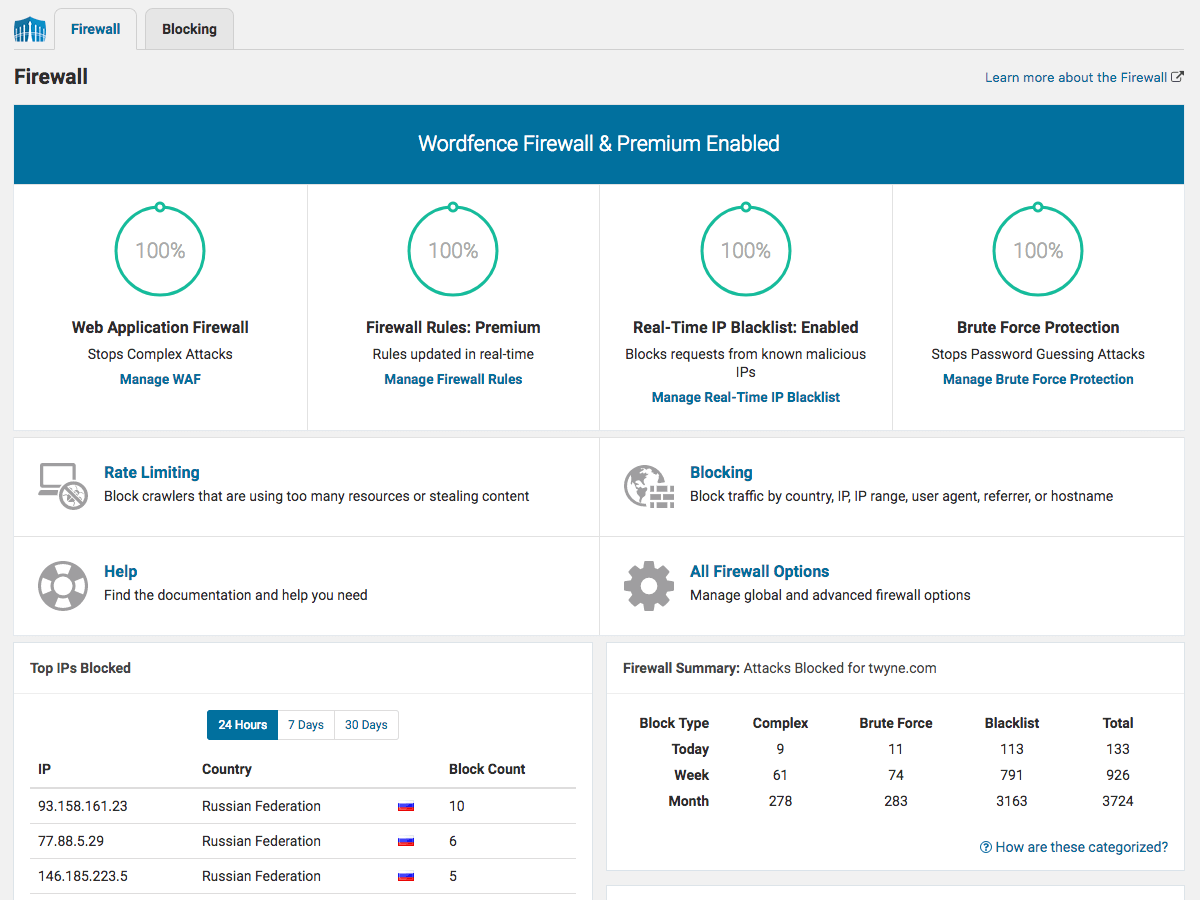
New Firewall Interface
The firewall interface has changed significantly. The main firewall page now includes four status circles, providing a broad overview of your site’s configuration status at the top. All firewall-related options are now accessible via the options link on this page. All firewall-related reporting is now available here as well.
Blocking and Rate Limiting are also now available via links on this page.
New Scan Interface
We’re really excited about the new scan interface. It’s exceptionally functional, very usable, and beautiful at the same time. At the top you’ll find status circles, summarizing your current configuration status. Below that, you will find the “Start new scan” button, along with links to Help and Options.
The Scan Options area is now where you set up scheduled scans. We removed the Scan Summary section and replaced it with a new status summary bar, displaying what the scanner is working on. The Scan Detailed Activity is now hidden by default, but you can reveal it by clicking the “show log” link above the results table.
The scan findings table has been revamped to show a summary view of each finding by default. You can view the details of the finding, and take action on it, by clicking the “Details” icon.
We also added statistics to the top of the table showing a summary of what the scanner found the last time it ran.
Other Updates
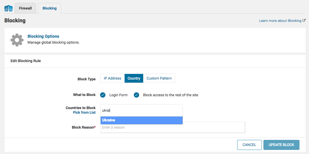
The Blocking interface has been completely redesigned. IP, Country and Custom Pattern blocking features have all been combined, and block count reporting is now available for each blocking rule you create. You can now manage and monitor the effectiveness of blocking rules in one place.
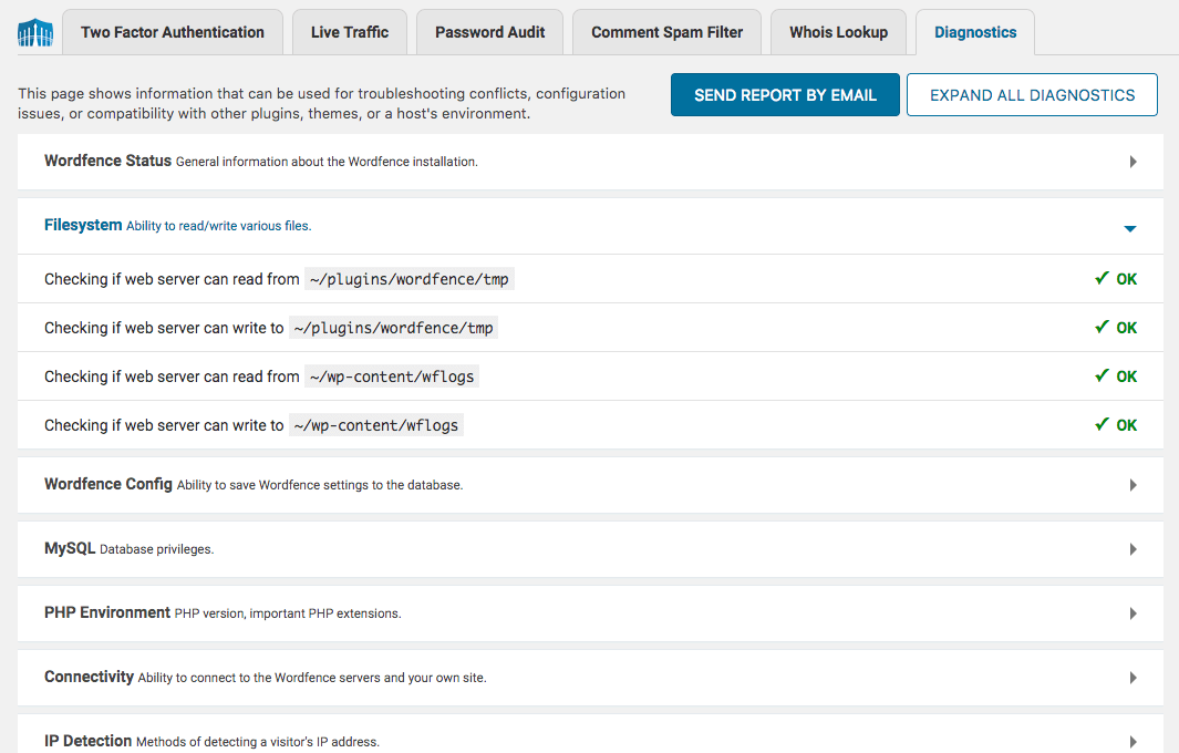
The Diagnostics page has been completely redesigned. All diagnostics sections are now collapsible, and collapsed by default, to make it easier to find what you’re looking for.
We replaced the product tour with a new guide that runs as you access each area of the plugin. We will be leveraging this new capability when we roll out new features that require more in-depth explanations, including the launch of Wordfence 7.
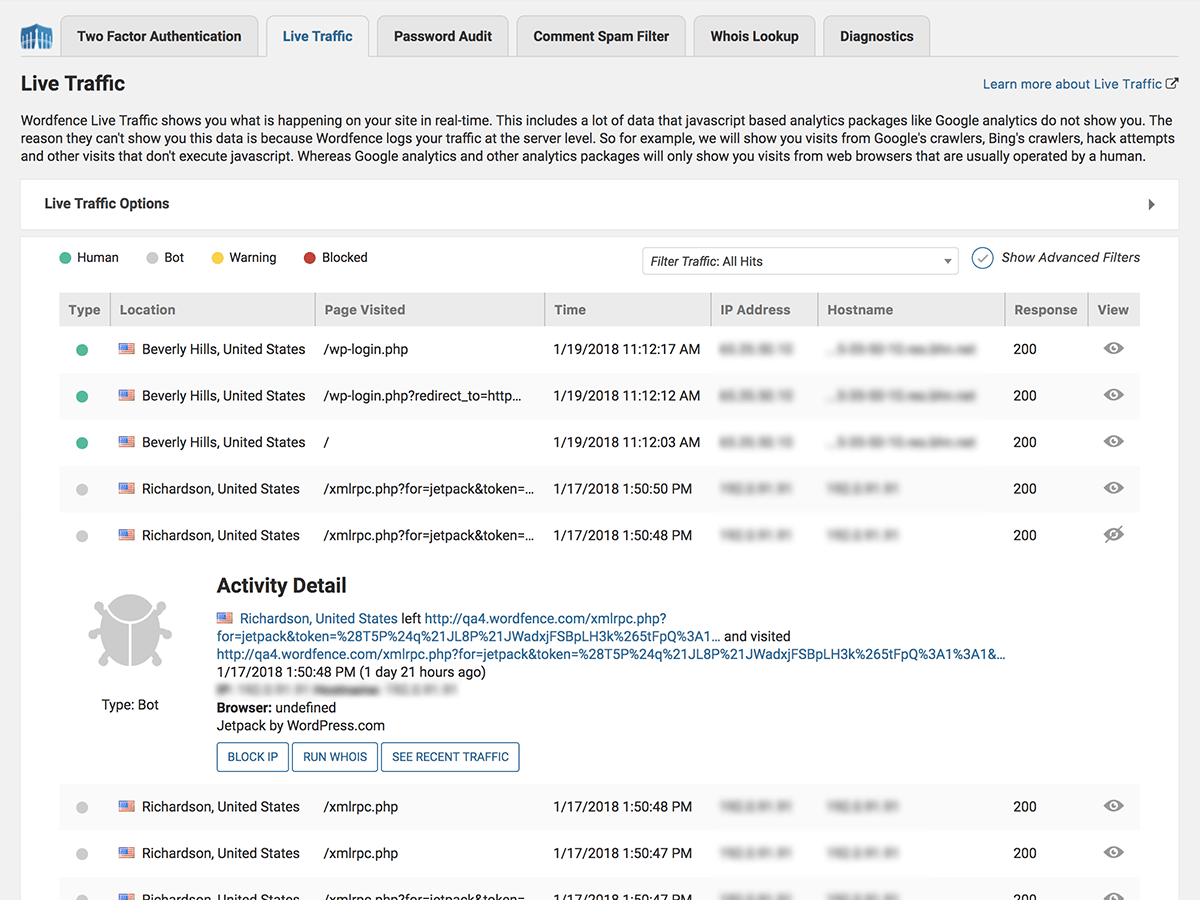
Live Traffic has been completely redesigned. The traffic table now shows summary data for each observation. You can view more detailed information by clicking the “View” icon. Viewing whois information and seeing recent traffic is now presented in a beautiful popover.
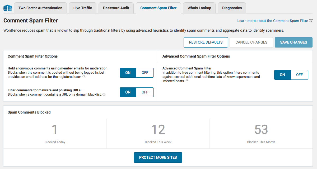
Wordfence has always included a great comment spam filter. Unfortunately, it was buried in the Options page, split into two different sections. In Wordfence 7, it now has its own page in the Tools section, which now includes basic reporting.
Thank You
It took us many months to get this right, and many people contributed to making this release happen. A big thank you to the hundreds of beta testers who helped us over the last couple of weeks. Your feedback has been invaluable.
With today’s release, we are excited to bring Wordfence 7 to the global Wordfence user community!
If you do find an issue, please submit tickets via Premium support or the forums so we can get them fixed. And as always, we welcome your comments here.



Comments
10:54 am
The previous version of required 11 (?) tables to be used. Has that number changed?
11:33 am
No the number of tables has not changed. This is a UI refresh, so nothing in the core or DB schema changed.
11:00 am
Just want to say THANK YOU! Wordfence is the number one plugin I recommend to everyone I help set up a WP site with. The new changes look great!
11:02 am
I think you might need to change the css/js filenames, or the version numbers.
I had to do a hard refresh after update as there was no styling for the admin and the product tour didn't work.
11:08 am
Thanks, Rob! I'm sorry to hear that you had trouble. If you run into any more, please do post in the support forum or, if you're a Premium customer, submit a Premium support ticket, and we'll be happy to help you out!
11:05 am
Will V7 automatically show up as an upgrade in our WP plugin section, or do we need to download it manually?
11:12 am
Hi Moofie, if you don't have auto-update enabled it should show up as an available update in the plugin section.
11:05 am
Looks great! A welcome update to the WordFence UI. Can't wait to dig in :)
Patrick Steil
https://www.churchbuzz.org
11:06 am
With the features of your version 7 updated, please tell us if we have the same speed as previous versions or if that did not have an increase in wordpress features for loading?
11:33 am
It is still just as fast. There was no change to the core firewall and scan engines or anything else in the core. It's just a UI change. As part of our testing we confirm performance and can confirm the firewall and scan are still ridiculously fast!
11:09 am
Using your product for each customer project!!! Thank you for this super opportunity!
Paul
11:10 am
Yes it looks awesome but I think it gets in conflict with another app...
This is the first error
WordPress database error: [Table './site_wp632/wpxbfubk_wfHits' is marked as crashed and should be repaired]
SELECT MAX(attackLogTime) FROM wpxbfubk_wfHits
11:17 am
Hi Dan, we'd love to help you out, but I'm afraid we're unable to provide support via blog comments for any technical issues that may occur with the new update. Please do post in the support forum if you're a free customer, or submit a Premium support ticket if you're a Premium customer - either way, our support staff will be happy to help you with this ASAP!
2:50 pm
Hi Dan, that issue has nothing to do with wordfence - you just need to repair that database table
11:11 am
This is a great approach to the redesign, nice dashboard changes, simplification, and a change in product focus to firewall & scan! I'd like to see a different pricing structure down the line. Thanks for the awesome freemium product!
11:17 am
Wordfence is the very first plugin I load and activate when deploying a new WordPress server, and this update just confirms that use.
11:24 am
Thanks John, that's great feedback!! Will share with the team.
11:18 am
Sounds pretty great. Thanks for all that you do! One question I have is ... will my existing WF settings remain in place when I upgrade? Or will I have to reconfigure my settings on all the sites I have that run WF?
11:22 am
They will definitely remain. You don't need to reconfigure anything.
11:24 am
Just chatted to QA and Dev to see if they have any additional comments. There are a few new settings, but all your settings will be seamlessly migrated over and the few new ones have sensible defaults so you don't actually need to do anything.
This is a UI refresh release, so the back-end stays the same. We have just made the product a lot cleaner and easier to use.
11:31 am
Awesome, thank you Mark and your team!
11:33 am
Dear Mark Maunder and team: I am very pleased with Wordfence (Defiant) and WordPress in general. I am the sole owner of this website and have surely gone through the ropes to gain the most in security. With Gravity Scan as a badge I humbly say that you are all the best with your technical expertise. With no budget, I am working to grow the site now and I am confident as I grow, I can implement more that you have to offer, in the future. I am very appreciative. Please accept my gratitude. Ed
11:35 am
Thanks for improving an already great product!
11:37 am
Thanks Eric!
11:49 am
Can't find option page to add premium key in ver. 7
11:53 am
Hi Peter, clicking on the 'Global Options' link on the dashboard will take you to it. It's the top section, labeled 'Wordfence License'.
11:56 am
Nice work! I just updated.
I noticed this UI, and I think it's pretty confusing https://i.imgur.com/fhPIrtN.png. To me, this indicates the WF Security Network blocked the whole country of France from accessing the site. I *think* it means it only blocked that user.
Also, it'd be good to see the type of request - POST/GET/etc, and for POST requests, would be super cool to see what the POST data was, or at least the first N characters, to see what type of hack they're trying to execute.
12:06 pm
Ah yeah I see what you mean Artem. Am sharing with the team. We should probably say in blocked...
12:03 pm
Thank you, as always, for your helpful work for all of us.
12:20 pm
Is there a chance to add an additional page with all the settings on one page?
I agree that changes are necessary. I understand that the advantages of the premium version must be highlighted, but clicking a few screens to configure all the necessary options and settings is really time-consuming and frustrating - at least for me :) (I use Wordfence free and premium on daily basis)
Thanks!
2:17 pm
+1 to this. Shoot Yeah! I'd like to see the Options Page bought back as it's a LOT faster to start from the top and work down all the settings... A Lot Faster!
7:37 pm
Thanks Chook. Shared with the UX team.
1:31 pm
Looks like a great update overall - Thanks! I especially appreciate the enhanced activity detail on Live Traffic. One suggestion ... it would be nice to have the options to move Blocking & Live Traffic to the main menu a bit easier to access. I cruised around for awhile in both sections before finding those. Perhaps a couple of checkboxes on the Dashboard would be more obvious (and take a lot less clicks to accomplish).
1:45 pm
I love the new look and logical location for the settings. My only wish is that I could resize the column width of the URLs in the live traffic view. I'd prefer to see the complete URL for all rows at once instead of having to mouse over each individual line.
2:11 pm
Thanks for the feedback Elizabeth!
2:15 pm
I look forward to using the new design.
Well done guys.
3:16 pm
Wow!!! Wonderful update! GREAT JOB!!!
3:24 pm
Love the new interface but I do miss the live traffic feature. I used that almost daily to block attempted hacks and exploit. Now I can't tell what these IP's are doing or accessing.
3:50 pm
Hi Rose, Live Traffic is still available, in the Tools section.
3:25 pm
Just so damn good! Thanks Mark and Team.
3:47 pm
Congratulations on this fantastic update. Wordfence just goes from strength to strength!
3:52 pm
I agree with Elizabeth - it's important to me to see the complete URL for all rows at a glance instead of having to hover over each one.
7:35 pm
Thanks for your feedback.
3:58 pm
The live traffic view now hides the fact that the IP address already blocked and you have to select the eyeball icon to open the entry to see this attribute. It means that you spend a lot of wasted time looking at entries that come up as a warning (yellow indicator) only to realise they have already been administratively blocked already. It would be good to have this attribute at the top level view so you don't need to look into each entry.
7:36 pm
Thanks Grant. I shared that with our UX team.
8:38 pm
Thanks Mark - If there are any future changes to the live traffic view it would be great to have the ability to save set of filters that can be reloaded to show just the events that I'm interested in so I don't need to type them in each time.
For example, if I could setup a filter that does something like the following and have the option to Save it for next time, that would be really useful.
URL contains "Admin", OR
ULL contains "Author", OR
URL contains ".ssh"...... Etc
8:53 pm
I definitely agree! I just went through a long list & discovered many of them were already blocked. That's a lot of wasted clicking.
6:00 pm
With the 'options' page removed, what happened to the capability of putting specific strings in, for blocking. Are all of the previous ones that I entered being still enforced? In the 'blocking' section, I did not see a means of listing, or entering strings for blocking purposes.
7:34 pm
Hi Jack,
All features are still available and your existing settings are still supported and will migrate straight into the new version. Please post in our support forums or open a ticket and the team will help you find your way around.
Mark.
7:59 pm
Thanks much Mark. I like the redesign, which is a continued example of the forward progression of the Wordfence team/product.
8:28 pm
Thank you, that's very kind, especially your comment re our team. Every one of the Defiant team is amazing.
7:04 pm
Nice update. Quite the facelift!
I still believe that you should unbundle features to gain a larger share of paid users. There is 1 feature in Premium I would like, but my personal situation means it doesn't provide a $100 value for me.
Different usage and different costs means you should reconsider your lower end pricing.
Just my two cents.
7:33 pm
Thanks Kevin and thanks for the feedback.
7:16 pm
Nice update and much cleaner user interface and graphics. The update self-installed and runs just as quick in scanning if not quicker than before. I really appreciate being able to read the Live Traffic section the most. Thanks for the update Mark and team!
7:33 pm
Thanks Sara!
7:35 pm
Congratulations on this great and impressive upgrade. Thank you for your expertise.
7:38 pm
Thanks!
11:22 pm
I am missing my notification e-mails. I have severall small websites, to much to look after every day. So Wordfence mailed me when there were more login attemps or attack increases or other issues. Is there an alternative for that?
6:38 am
Hi Wm, so sorry to hear that your notifications have disappeared! We can't offer support via blog comments, so please contact support - our support staff would be happy to help you resolve what's going on.
12:09 am
Hi,
I have some javascript errors in wp-admin after update to Wordfence 7. The new function (or redefined) break all wordfence pages:
(function($) {
$('#circle-wf-scanner-type').wfCircularProgress({
endPercent: 0.6,
color: '#fcb214',
inactiveColor: '#ececec',
strokeWidth: 3,
diameter: 100,
});
})(jQuery);
Contact me if you want more details, please.
Thanks!
6:23 am
Hi Sebas, we'd love to help you out, but we're unable to provide technical support via blog comments. Please do post in the support forum if you're a free customer, or submit a Premium support ticket if you're a Premium customer – either way, our support staff will be happy to help you with this ASAP!
1:15 am
Thank you so much for your continued work, improvement, and success.
Really appreciate the expertise and your focus on making security a strong part of the WordPress setup while making it fairly easy to set it up.
8:20 am
Thanks Philippe.
9:23 am
Thanks. Every WordPress website I build has Wordfence. You guys rock!
4:33 pm
Like the new interface. So glad I got the premium version. For anyone serious about security on their website this is a must and the price is very reasonable and worth the peace of mind, esp after seeing how many attempted Logins are done every day.
Question: If country blocking is turned on and say France try's to login, should I also block their IP address? Is it redundant or an extra precaution?
Request: I use the Live Traffic feature weekly. Because there are SO many various attempts, it would be great to be able to Filter - Attempted Logins - not just successful ones. That way I (or anyone) could quickly filter for those and get them blocked ASAP - especially when they come from within the U.S. It can take an hour to scroll thru just 2 days of hits.
It would also be nice to have a tab or filter for attempts made that are not already blocked that we should look at. The Live Traffic feature is valuable and the one I use the most.
Thank you to the entire team for all your good work.
10:59 am
Hi Debbie, thanks so much for the kind words and the helpful request/suggestion - we've passed it along to the dev team. In the meantime, we'd be happy to help you decide what's right for your site's security posture (including manual blocking vs. country blocking, etc.) so please do send in a premium support ticket - we'll be happy to help!
11:55 pm
Great improvement, keep up the good work.
12:54 pm
Absolutely amazing work, the effort your team must have put into making this version, is mind-boggling, and I'm not just saying that as a user, but also as a full-stack web dev.
All hats off, and thank you for an amazing product !
I wish all security products were as great as yours !
9:36 am
Great work in trying to make the product more intuitive.
A wish that would help all of us that do not (yet) use the premium version: It would be great if you could subtly indicate on each status circle how high a score it's possible to achieve *without* the premium version. Because right now the score might be 59% for one of the circles, and it's only possible to go higher by purchasing the premium version. But it's kind of difficult to understand at a glance that 59% is the max score available in the free version.
I hope this explanation makes sense, and that it gives you ideas for better indicating to users of the free version when they have the best configuration they can achieve for free.
Keep up the great work :-)
7:47 am
Hi Kim, thanks so much for the kind words. We're so glad you're enjoying Wordfence 7, and we've gone ahead and passed your suggestion to the dev team - it's a great one!
1:07 am
Thanks for the update to the live Traffic view where we can now in the live traffic options select to have "Always display expanded Live Traffic records" enabled. This solves a huge problem for identifying attacks quickly.
5:18 am
OK THANKS!
I was not a fan of the new interface upon release. But you fixed live traffic so now is is REALLY useful again. It is easier to read too.
The little dots of color were difficult to read while scrolling. NOW big red X, bug icons & triangles all color coded is a huge winner for me. Also bringing back the buttons to immediately go to block, whois etc. THANKS.
Then you can read the whole story or most of it in the same section as well. Again...GREAT JOB!
Even going to the blocking page after blocking a range has merit. I would prefer going back to where I was in the live range list because I might be 7 pages deep on a deep dive of hacking prevention but I don't know if you can pull that off.
Not everyone will agree with me but apparently you guys listened to your customers.
Great update to your update.
Thanks!
Rex